People’s Choice
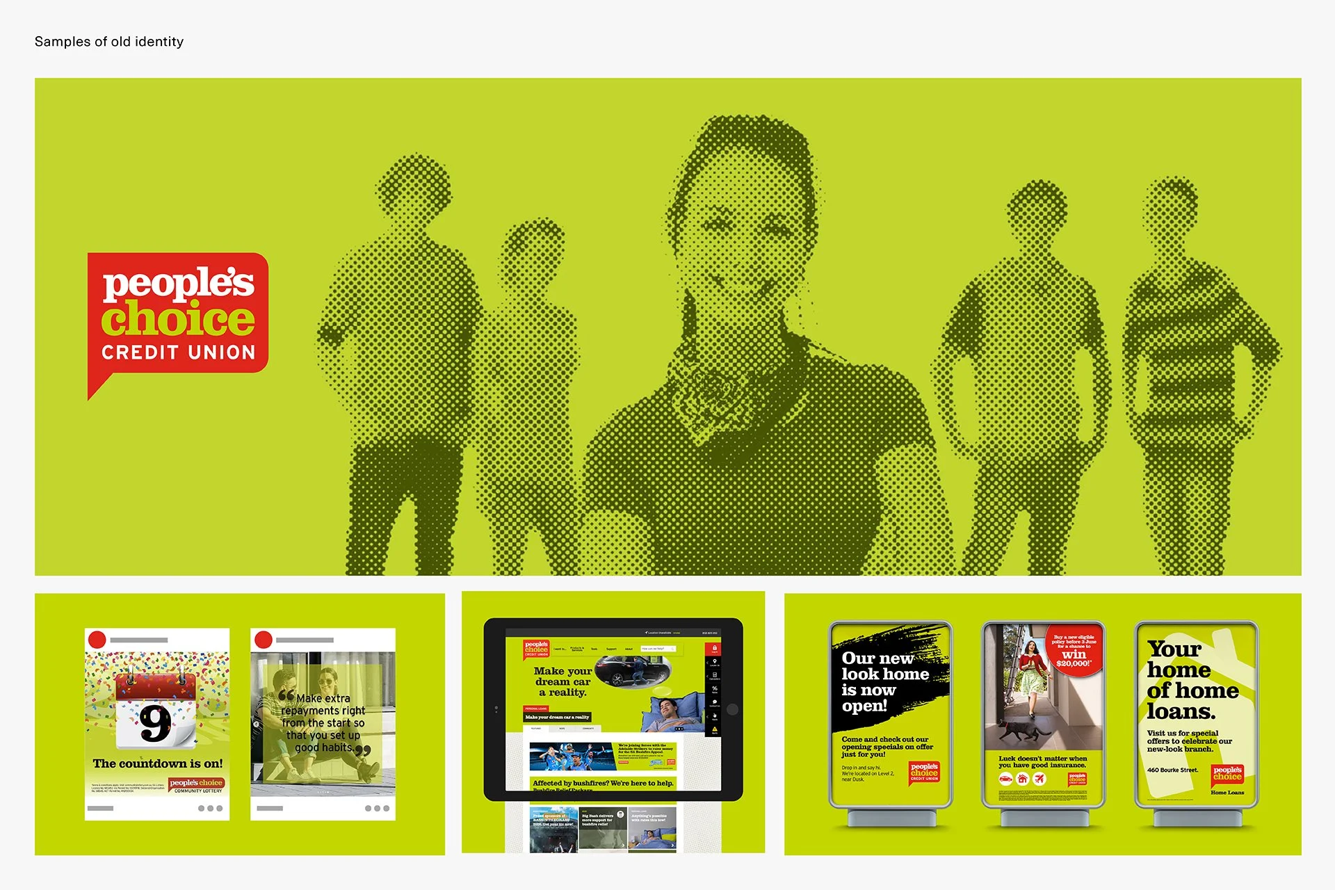
Due to the emergence of digital banking and the advent of Neo Banks, People’s Choice Credit Union observed that they were becoming less relevant in a market where financial institutions were providing new, innovative products. As Millennials were predicted to constitute the majority of the workforce by 2025, People's Choice acknowledged the need to reposition their brand to focus and educate this demographic, who lacked awareness of the advantages associated with banking with a Credit Union.
The Solution
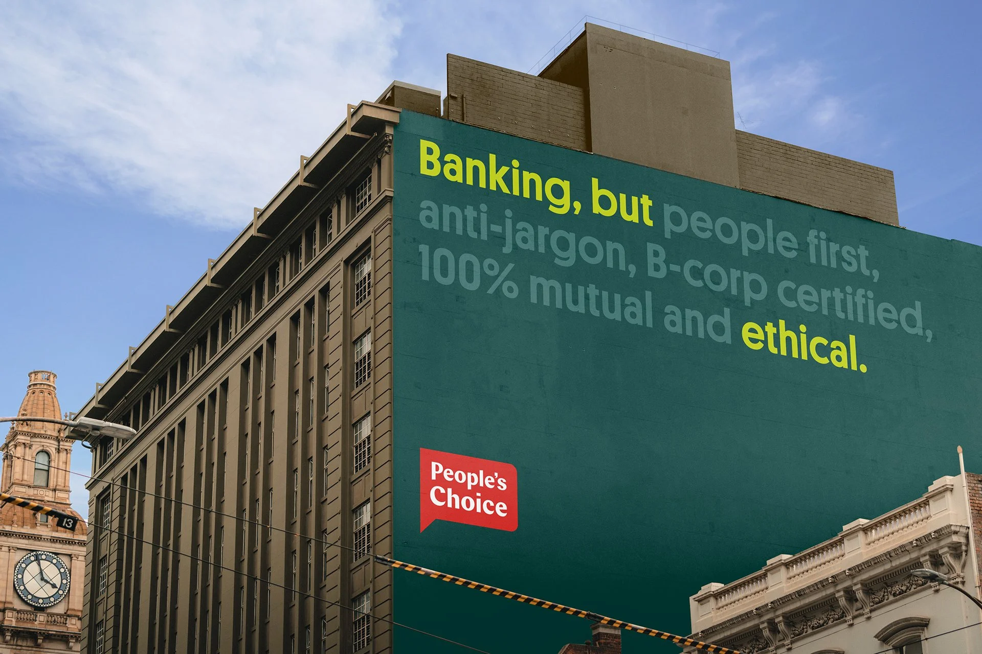
As an organisation that truly looks after their people, we developed a strategy based around being the advocates for positive change. We repositioned People’s Choice as the empowering activists in the market, to align with their primary values which champion the environment, the communities, and the individual members.
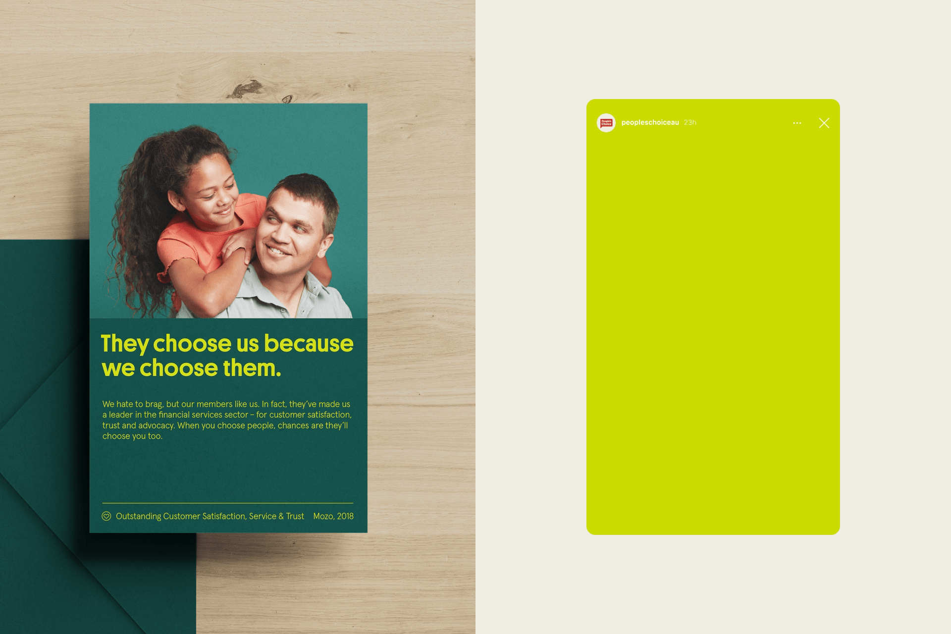
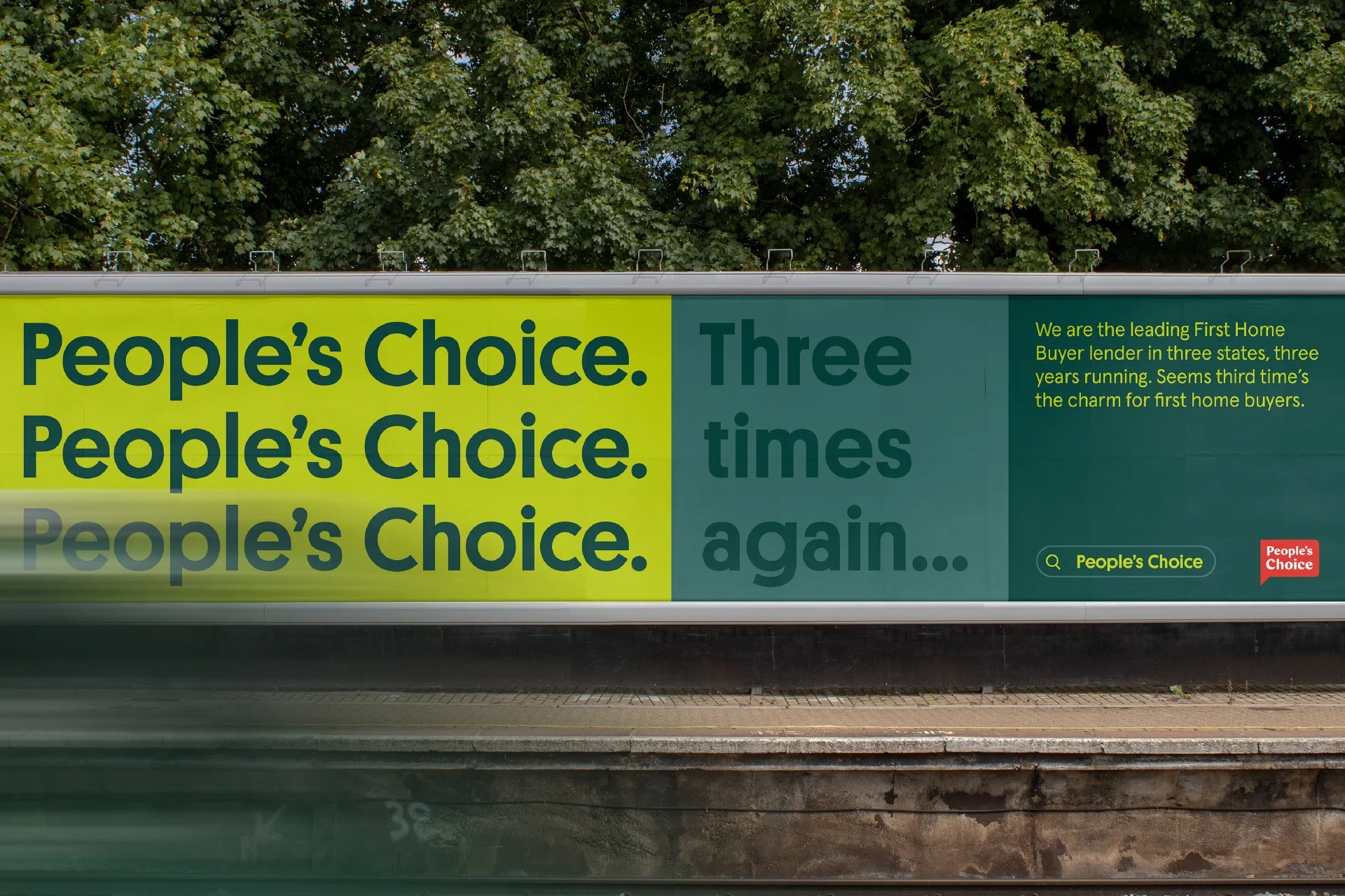
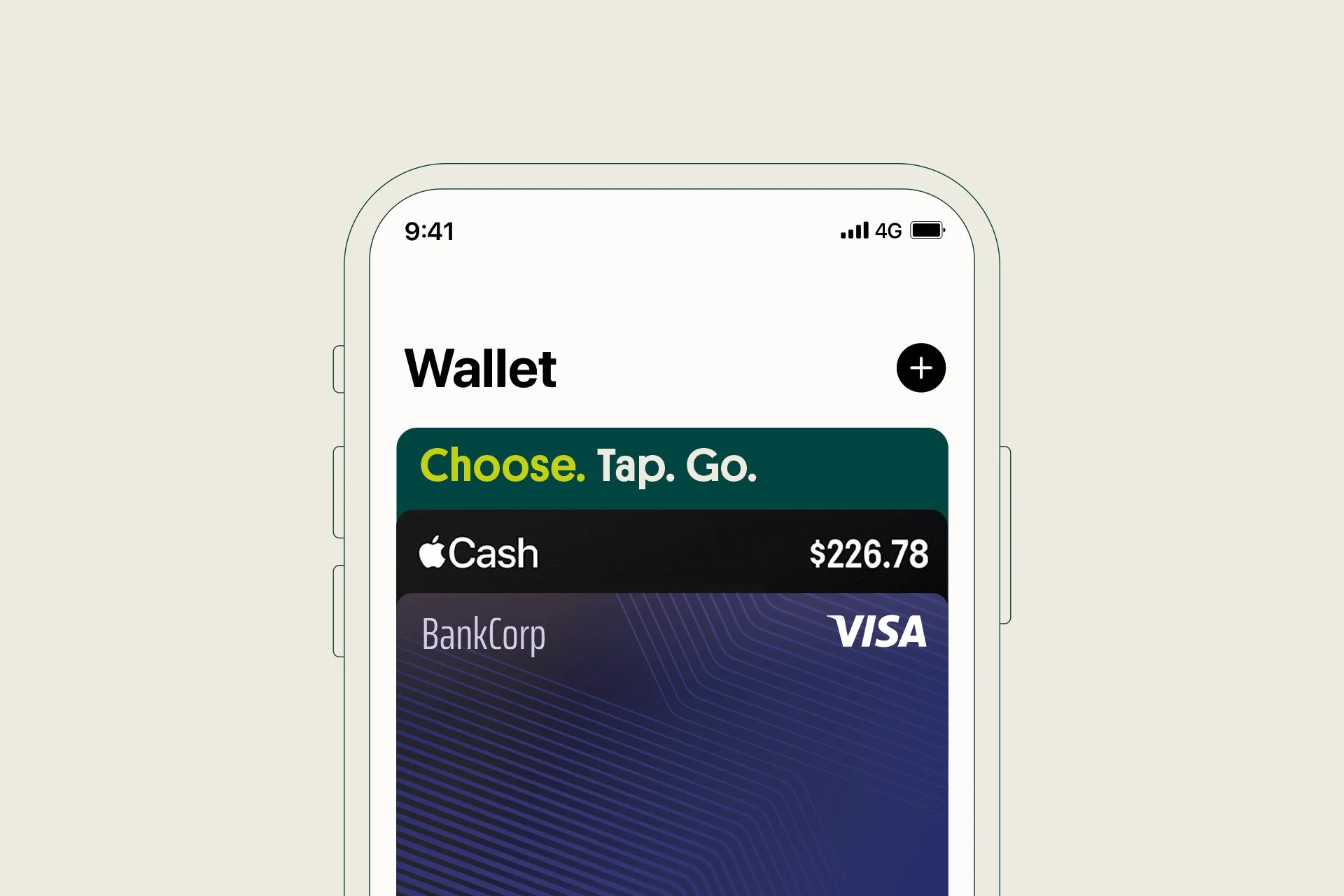
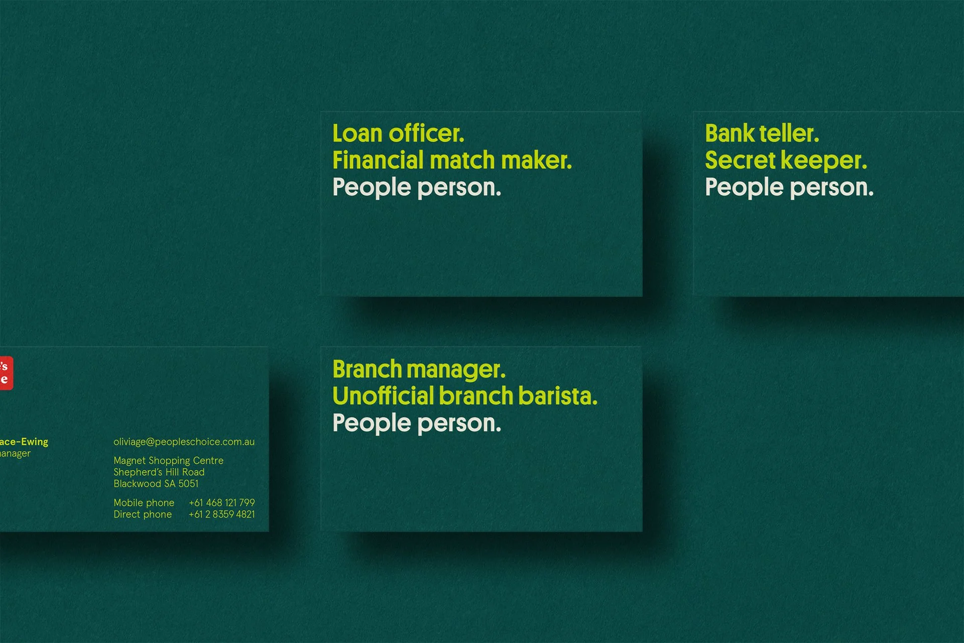
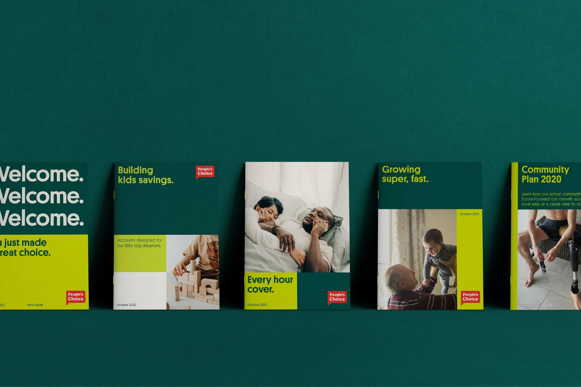
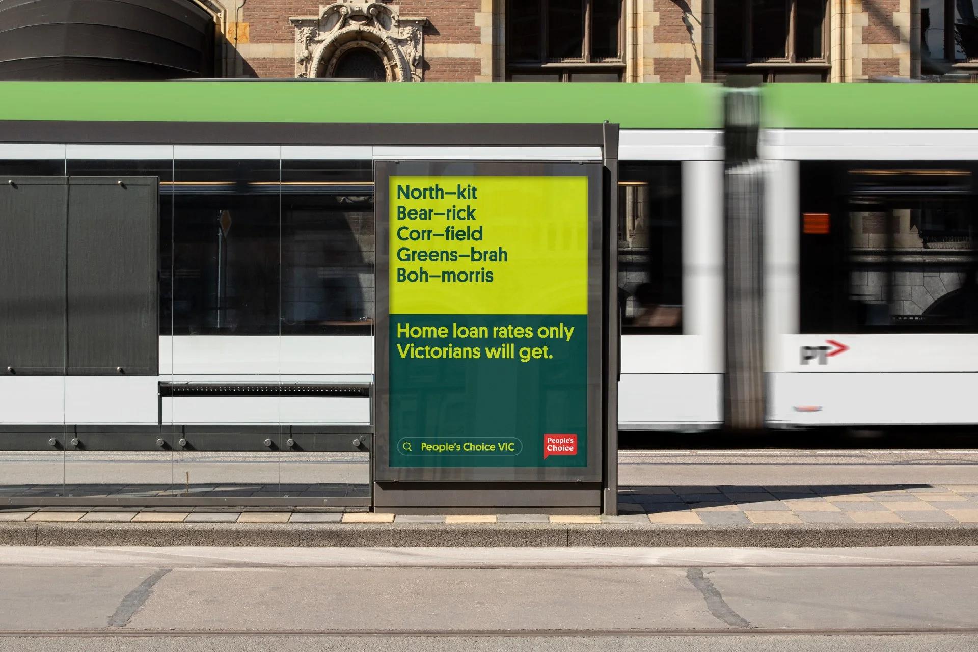
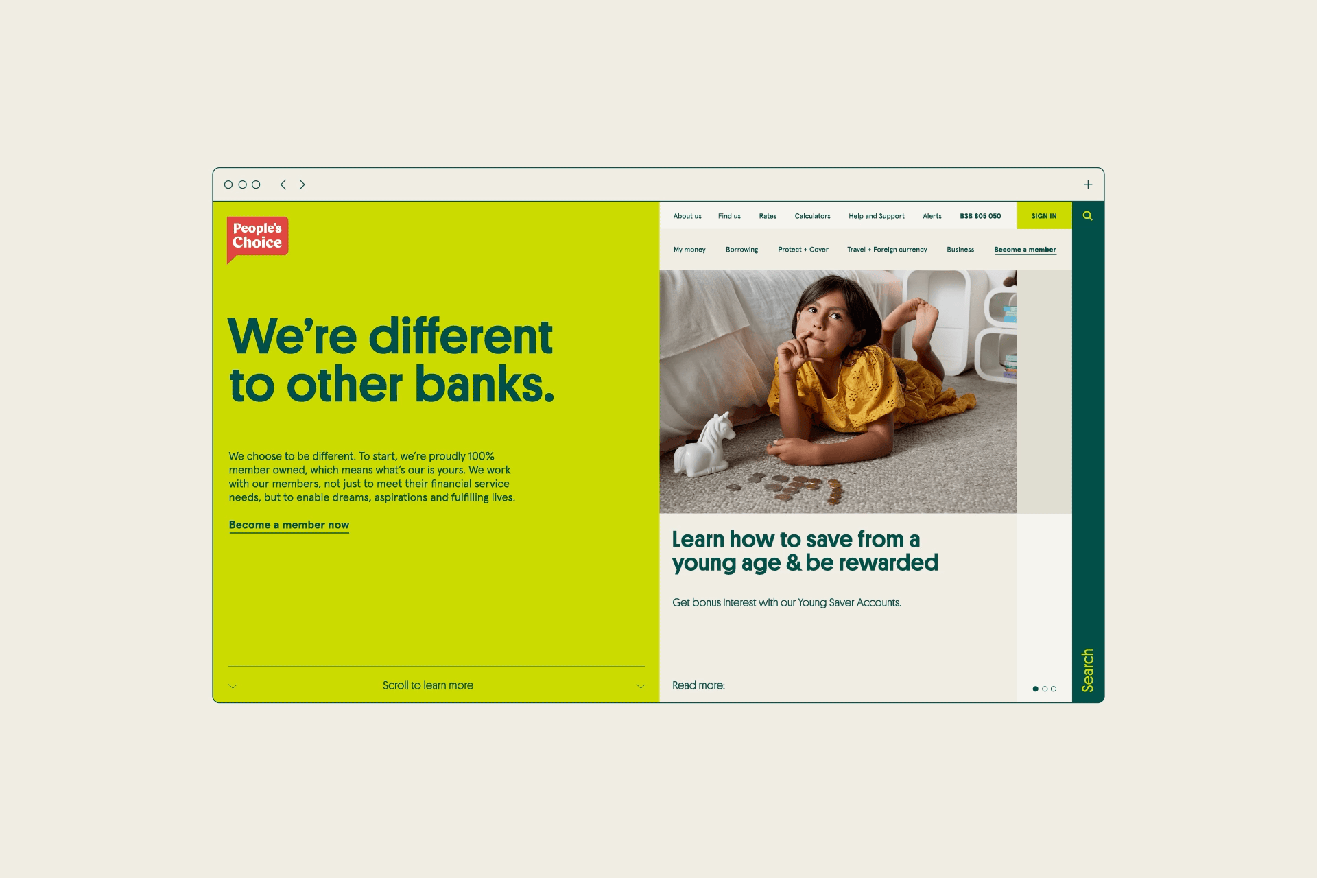
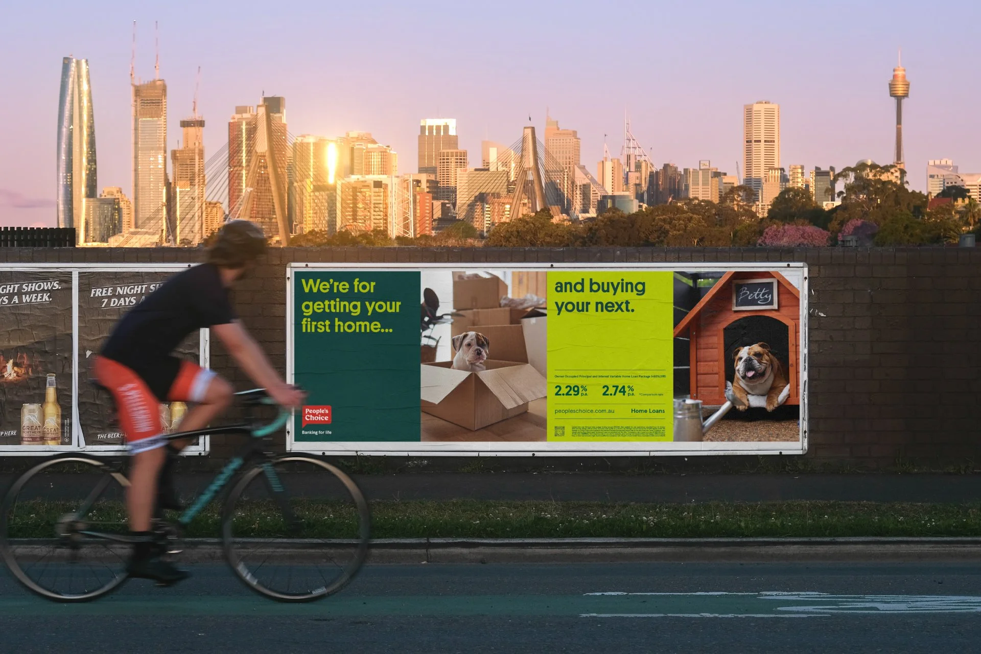
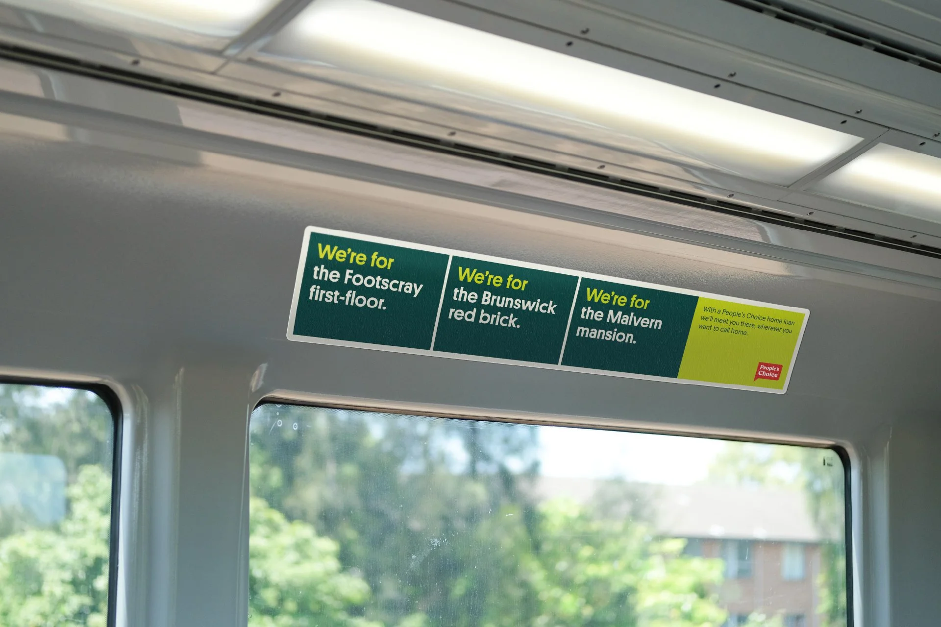
From this platform, we created an identity that celebrates difference, embracing the unique and the authentic. After all, no two people are the same – so why bank like it? We saw the opportunity to hero the people of People’s Choice: both members and employees. Using them as our reference, we aimed to create imagery that was honest, relatable, and supportive of the community. To reflect the diversity of the membership, we chose a font with quirky characters that convey a sense of humanity. By developing a transparent brand voice, we ensured the brand would speak to what truly matters to its people.


Colour Palette
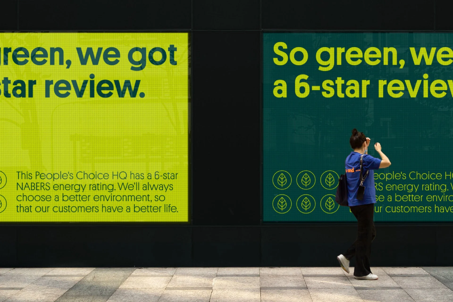
Red and green should never be seen. But these garish shades had been associated with the People's Choice brand for many years and were deeply rooted in their history. So, instead of discarding the colours, we identified them as sacred assets, and devised a solution to neutralise their visual clash. Our new palette brought balance, legibility, and modernity with the simple addition of two extra shades. By introducing secondary colours more in tune with the natural environment, our updated range provided a versatile guide for art direction, enabling the use of these shades across all brand imagery. As a result, all permitted colour combinations now comply with digital accessibility standards (AA rating).


Credits
Completed at Landor Australia
Client: People’s Choice
Design: Sam Wall, Abi Singmin, Elodie Hennessy-Trupheme
Strategy: Daye Moffitt, Ash Stapleton
Photography: Dan Boud
Production: Entropico
Client Services: Trish Folan, Lauren Kelly, Anna Smallfield