Lumos
A NSW Health initiative was established to shine a light on the patient journey, bringing together information from across general practice and the public health system. This groundbreaking program aimed to integrate health data to enable better care and deliver a unique evidence base for more patient-centred, efficient and effective outcomes across the healthcare continuum.
As a new initiative, the program needed a way to engage and express itself while showcasing its innovation in health. We were tasked with creating a unified brand strategy, name and identity for this pioneering project – introducing Lumos.
The Solution
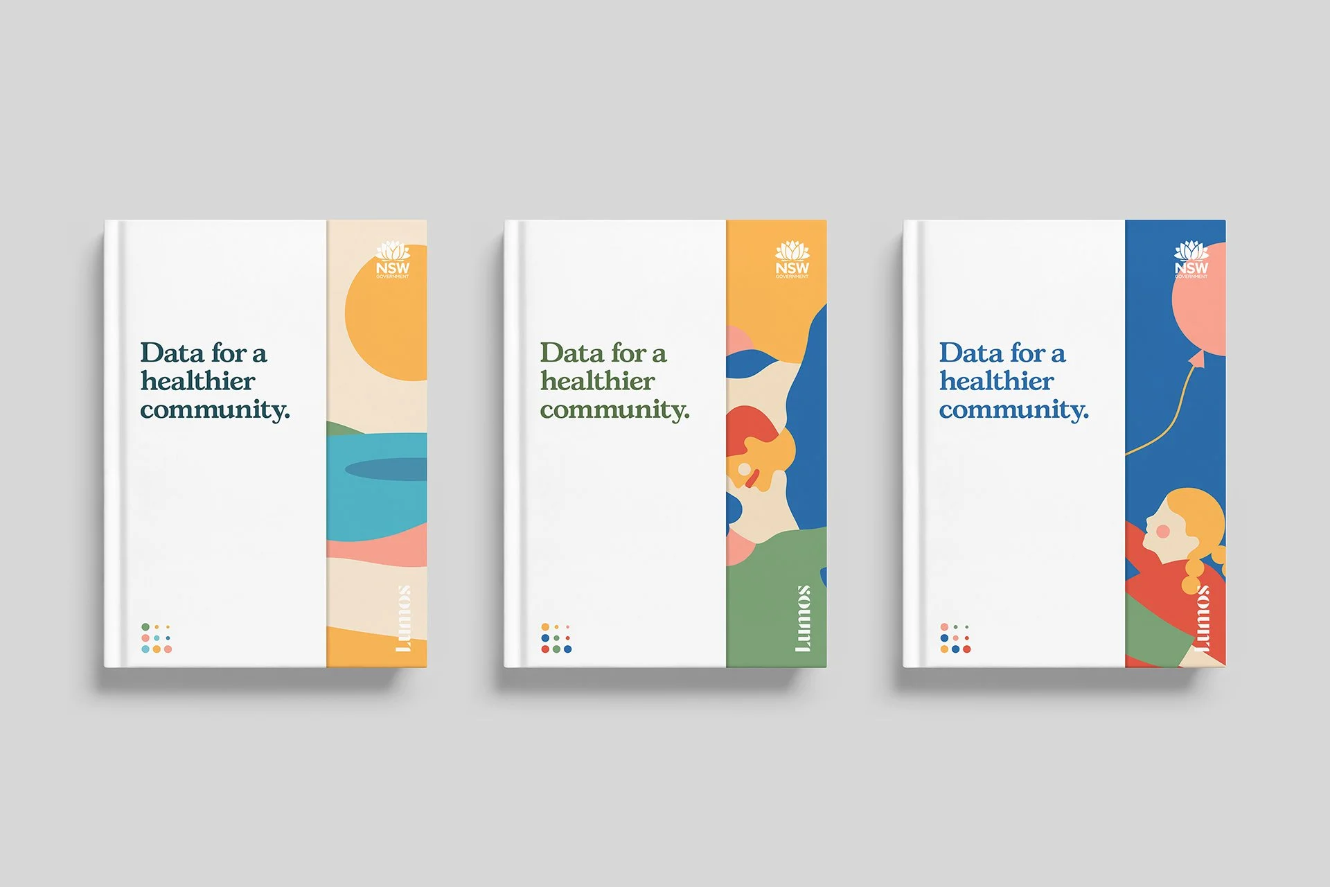
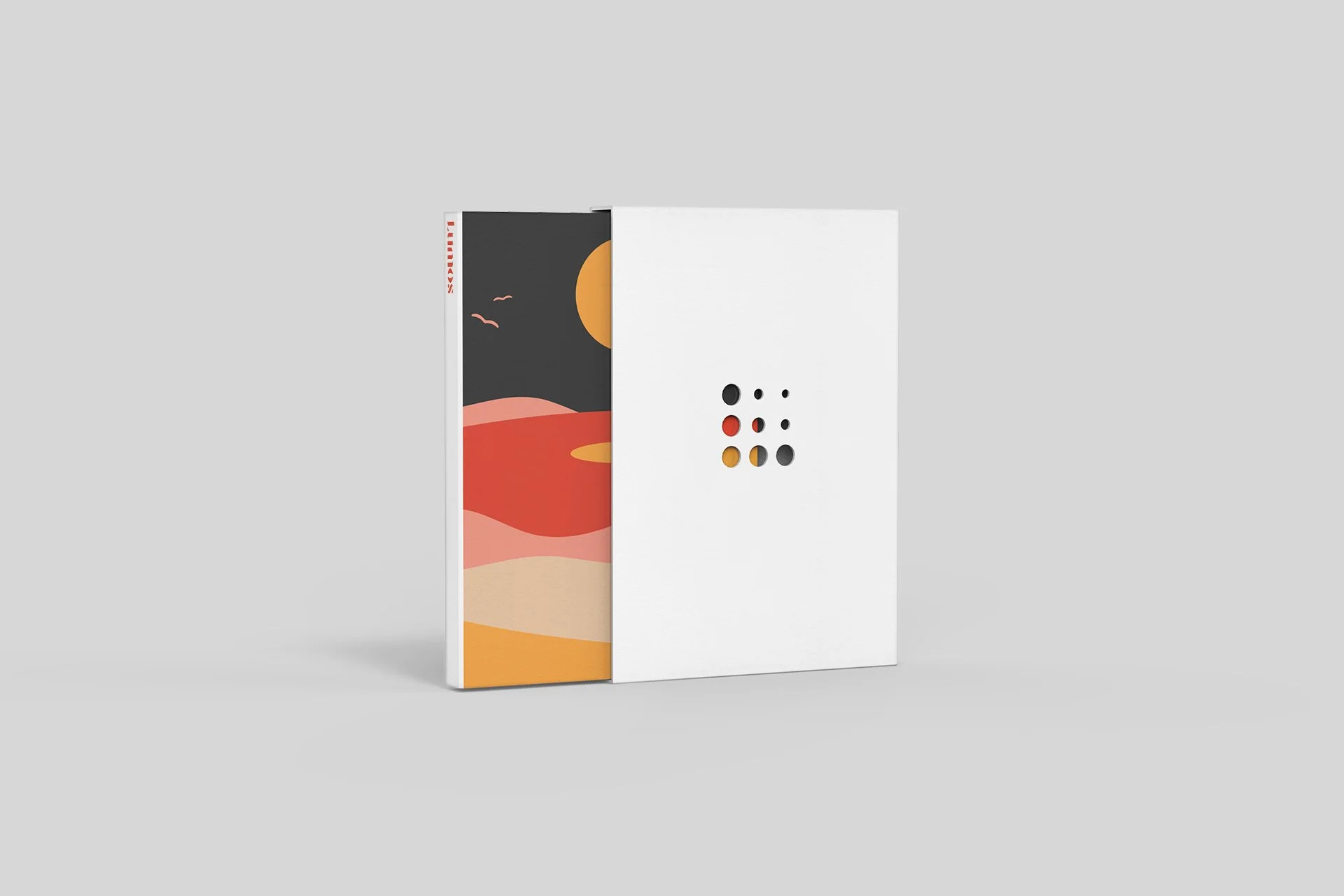
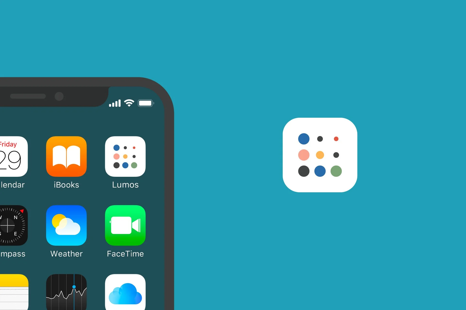
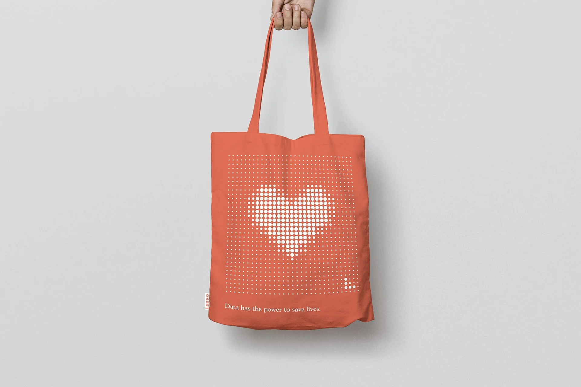
The power of data sat at the heart of the brand, together with the insights and benefits it could unlock. So, we asked ourselves: what if we created a brand that could not exist without data? This idea evolved into the concept of Illumination – an identity that could singly represent data, and collectively reveal outcomes.
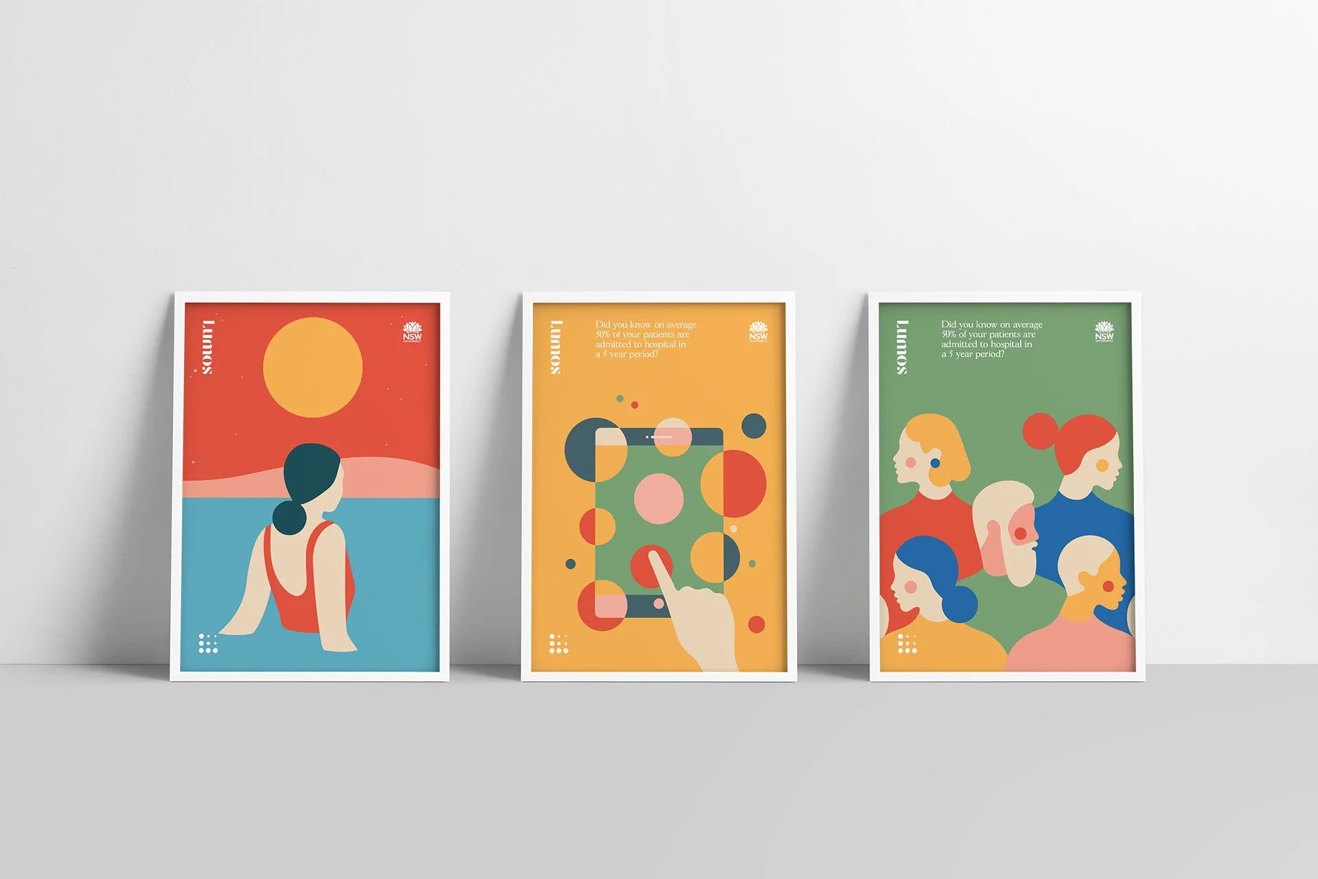
Using simple dots as data, we created a joyful visual language to showcase the positive impact the program enables for patient outcomes. A limited colour palette brought clarity across a broad range of focus areas, from aged care to mental health, Aboriginal health and population health.
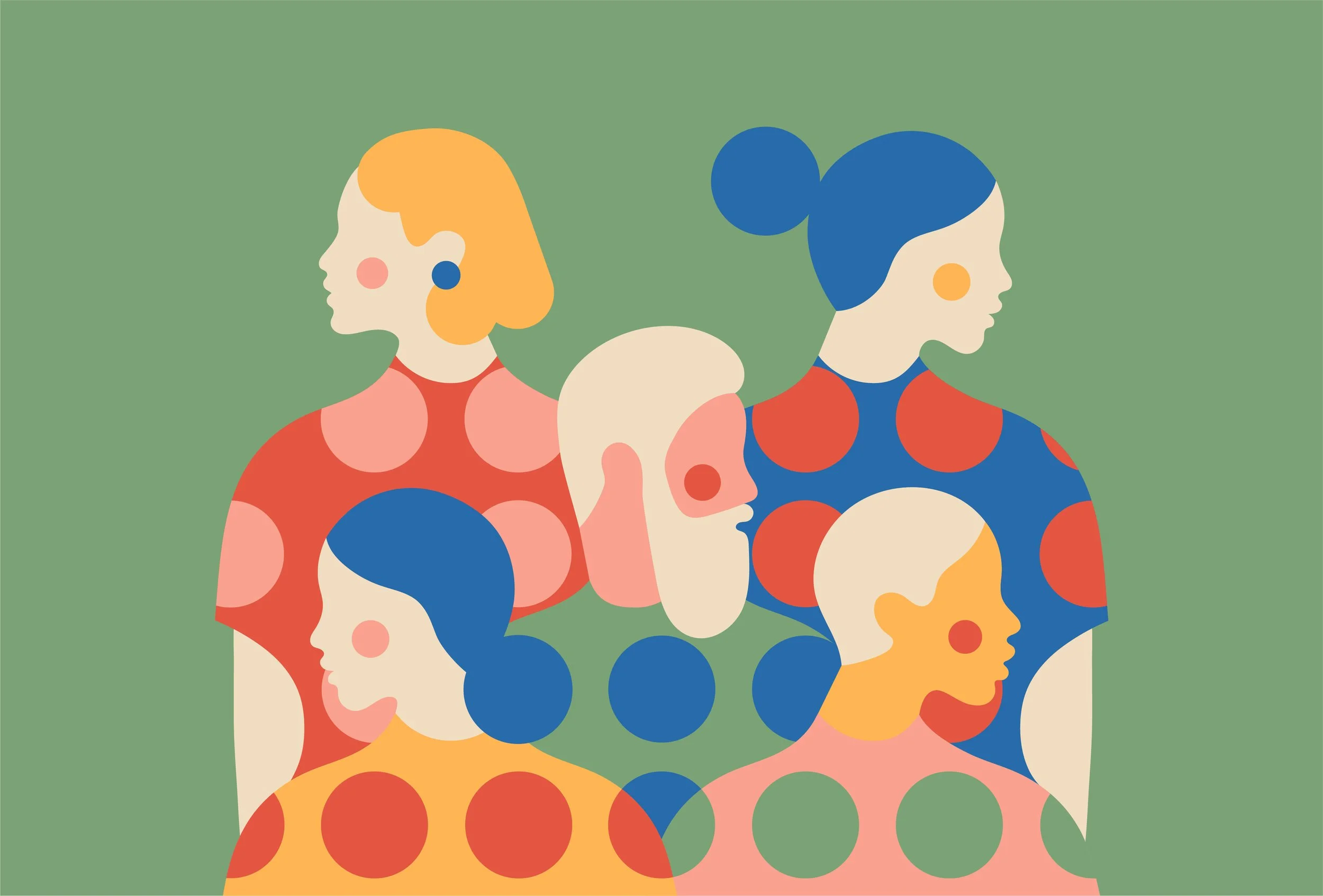
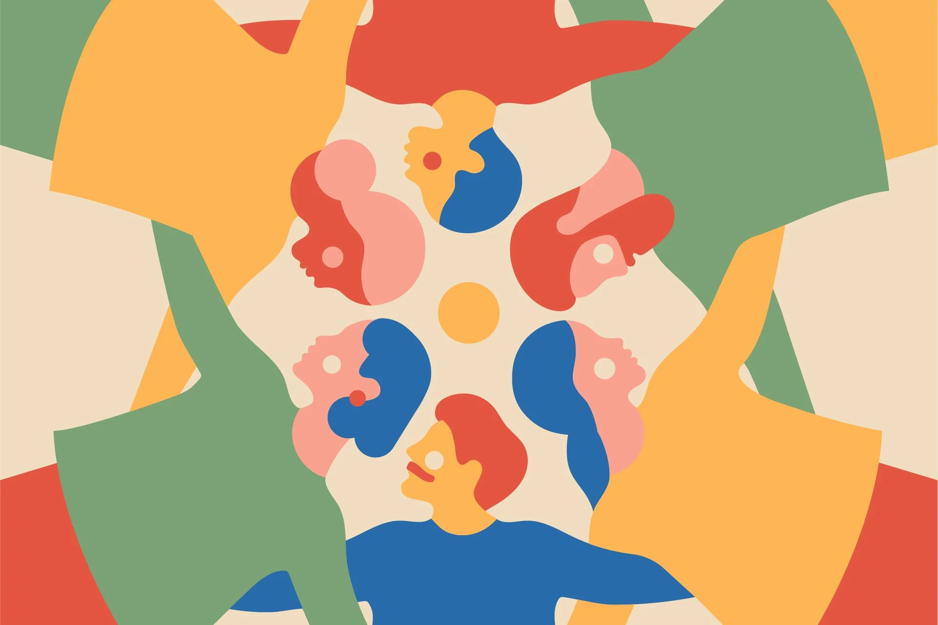
For a brand so closely connected to human outcomes, humanity was introduced through a minimal illustration style, also built from dots as data. Each composition was reduced to its simplest form, representing the diversity of people, communities and landscapes across Australia.

Credits
Completed at Landor Australia
Client: NSW Health
Design: Tom Carey, Abi Singmin
Strategy: Ashling Withers
Illustration: Cecilia Castelli
Client Services: Eeke Braaksma