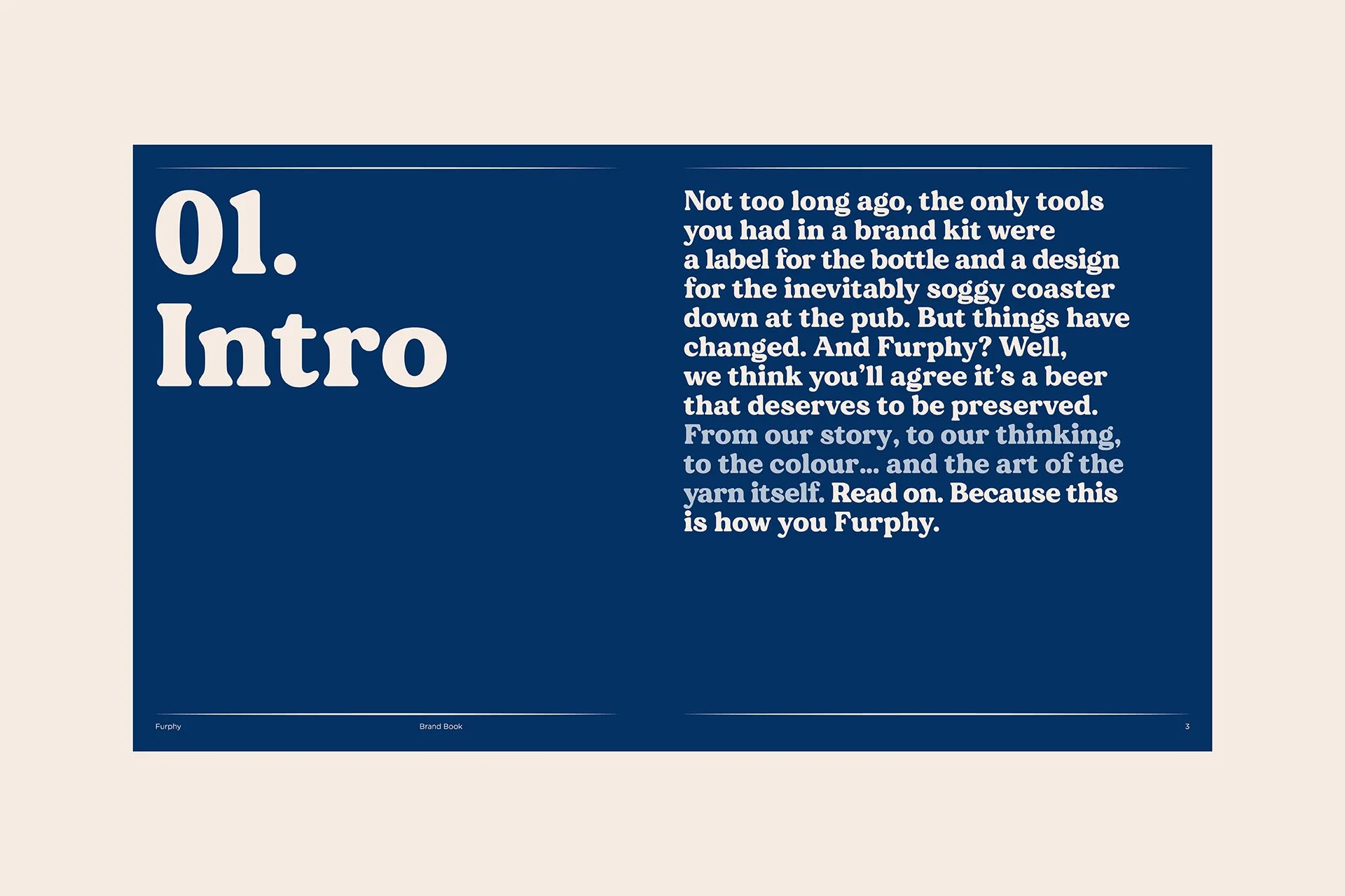
Furphy
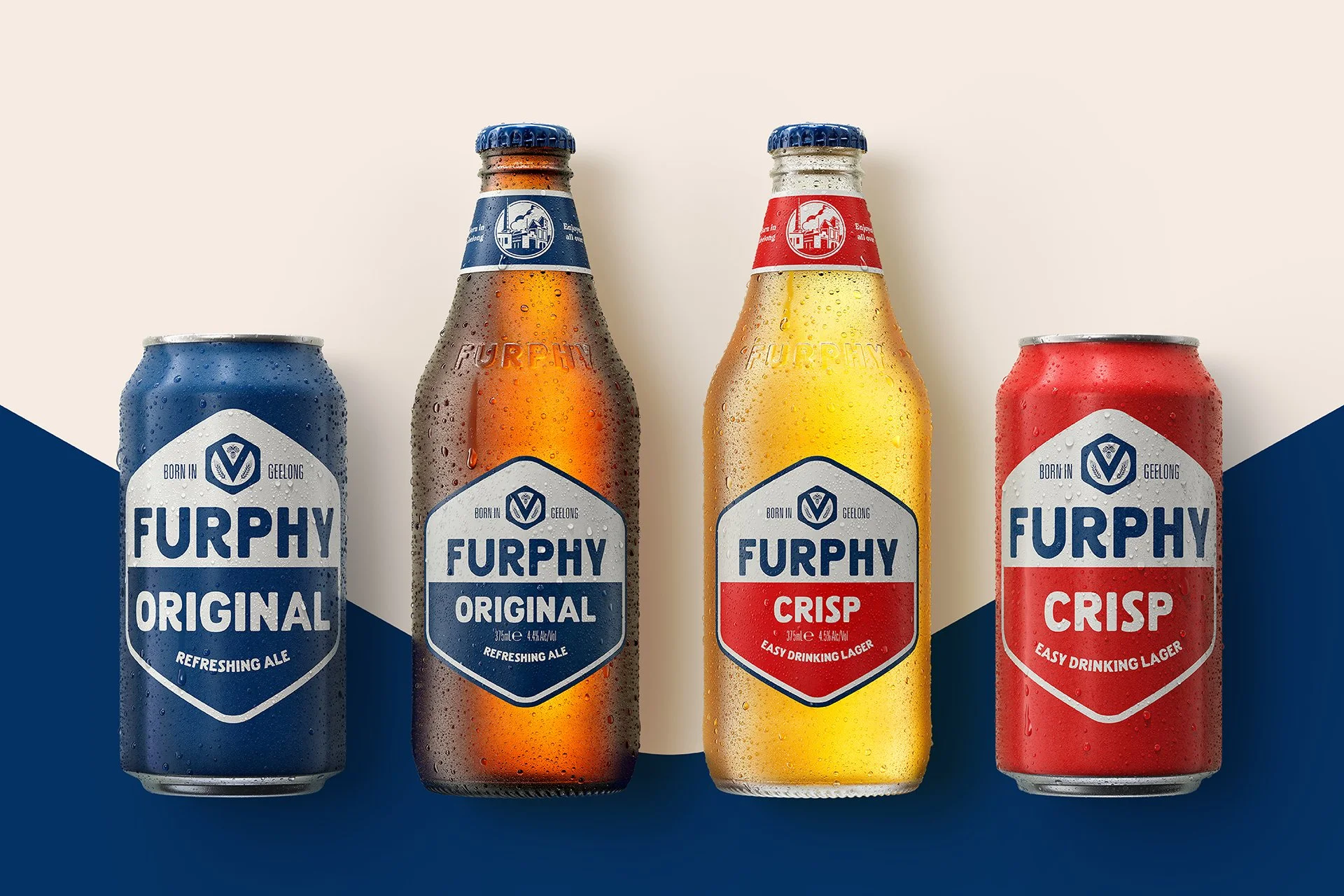
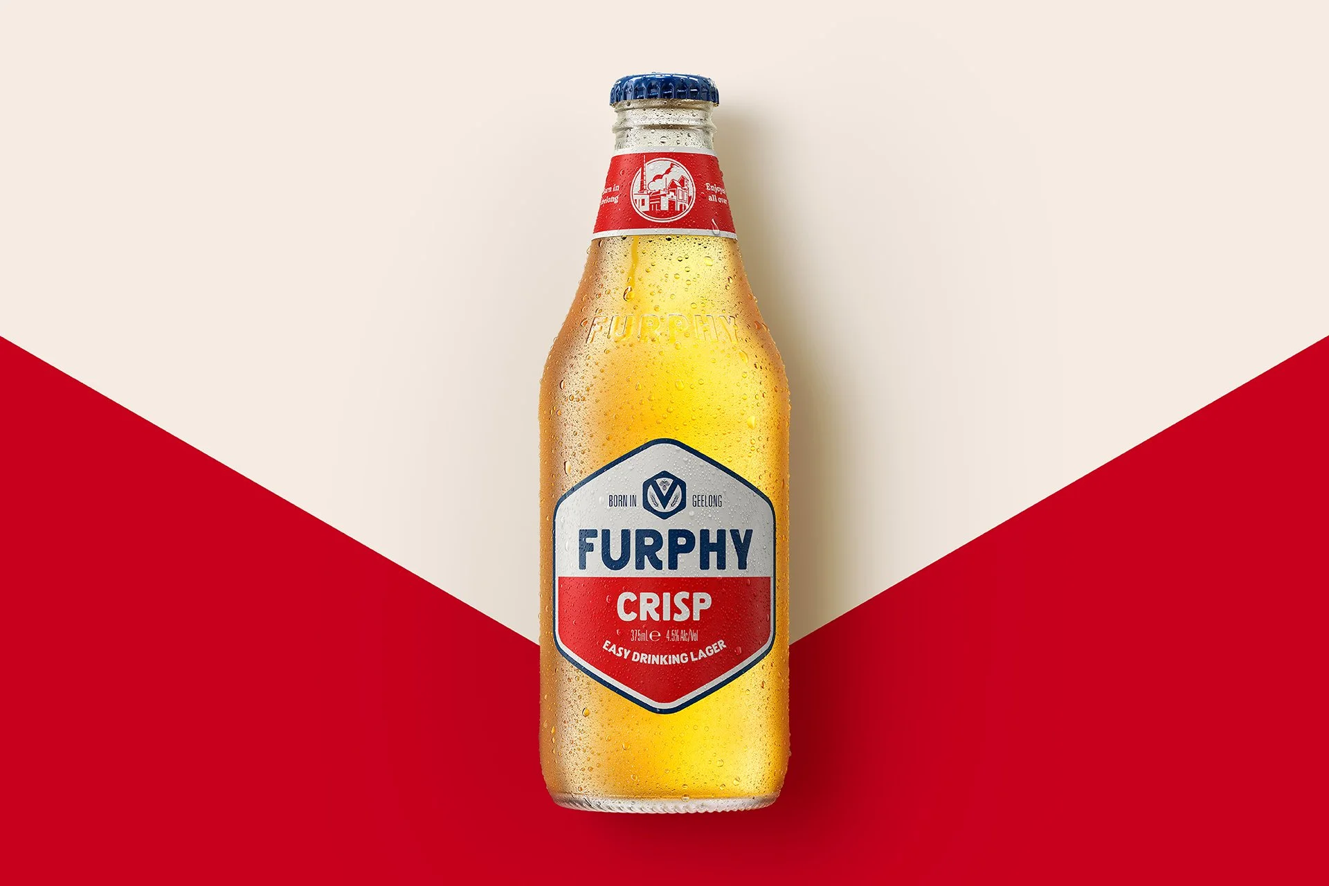
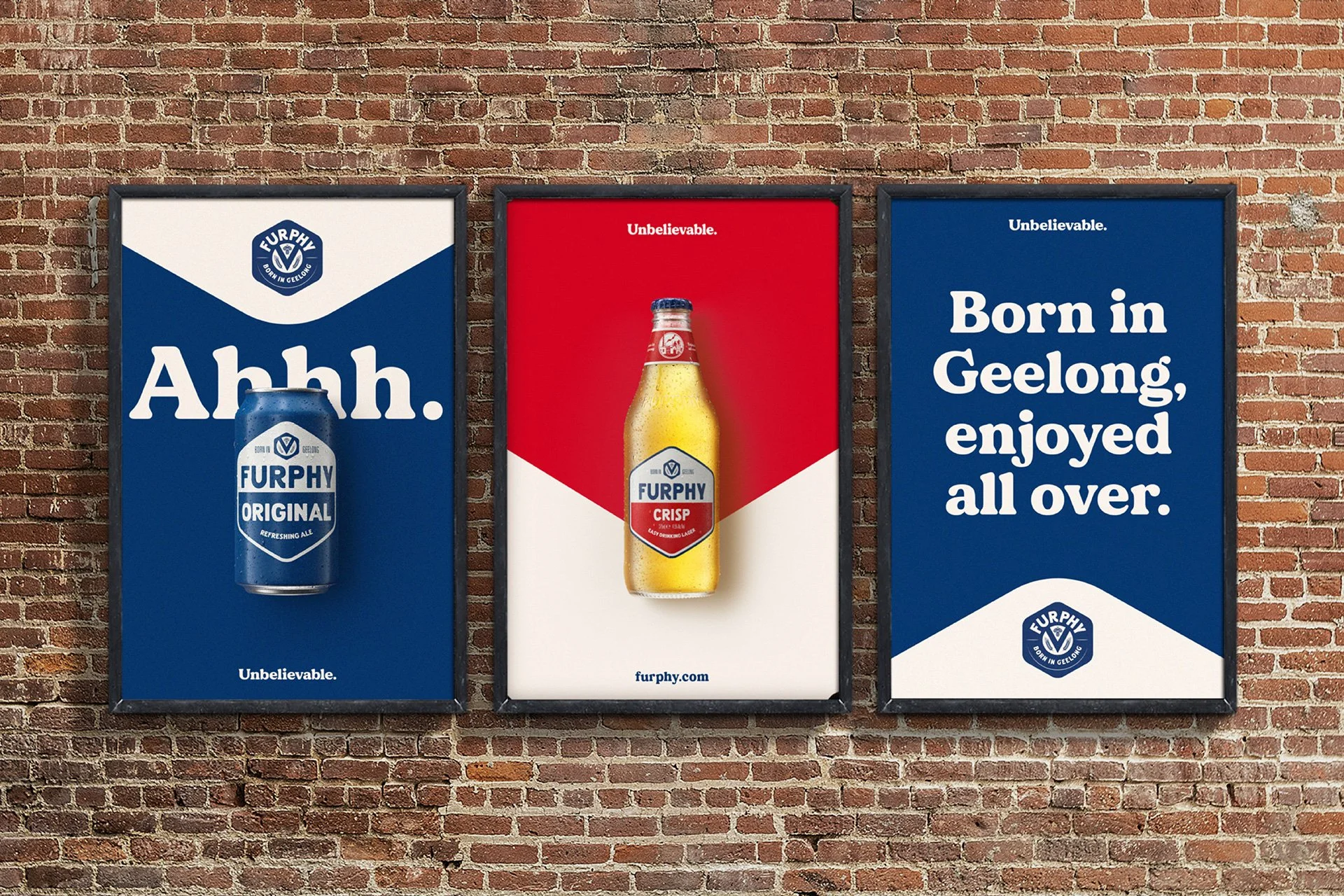
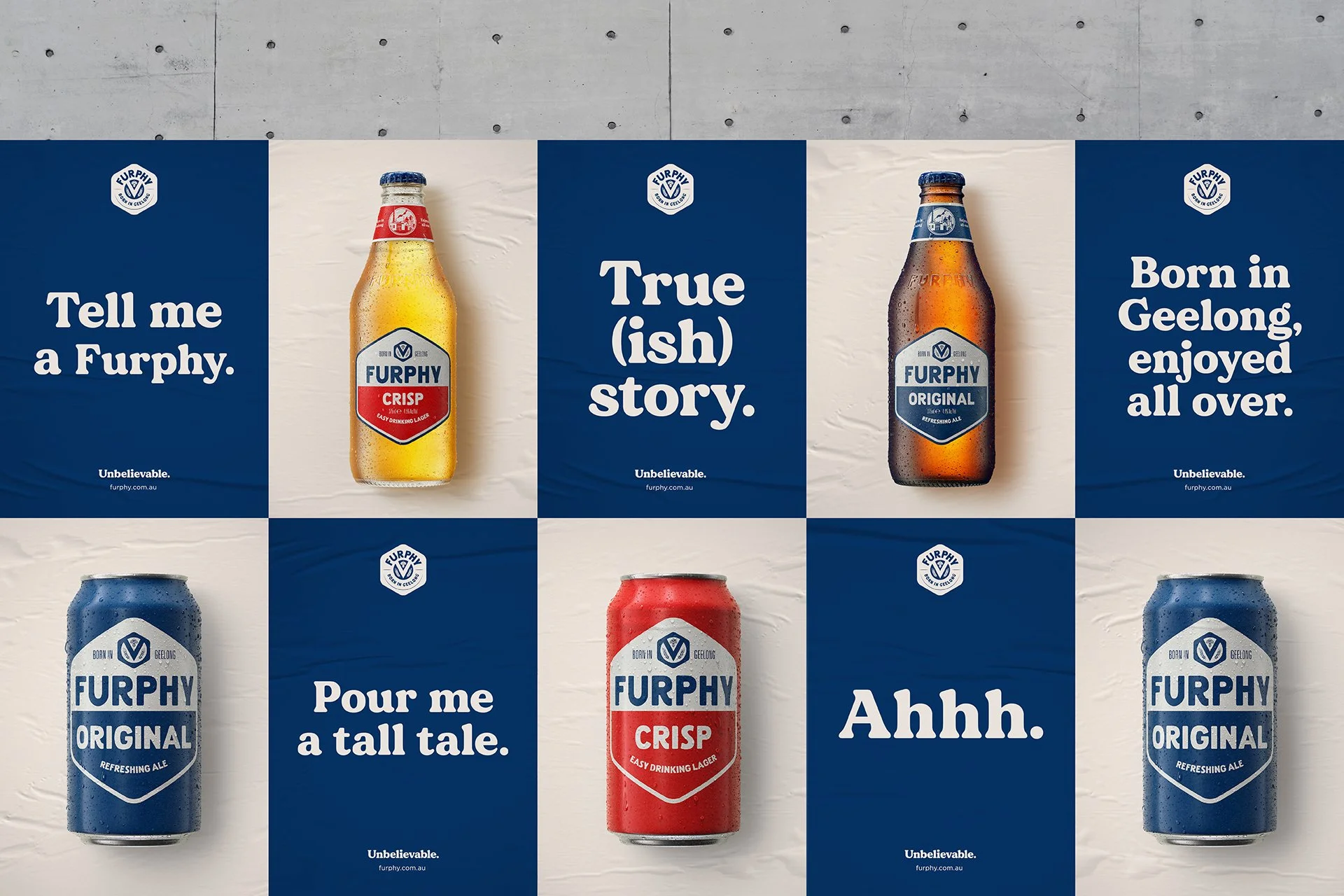
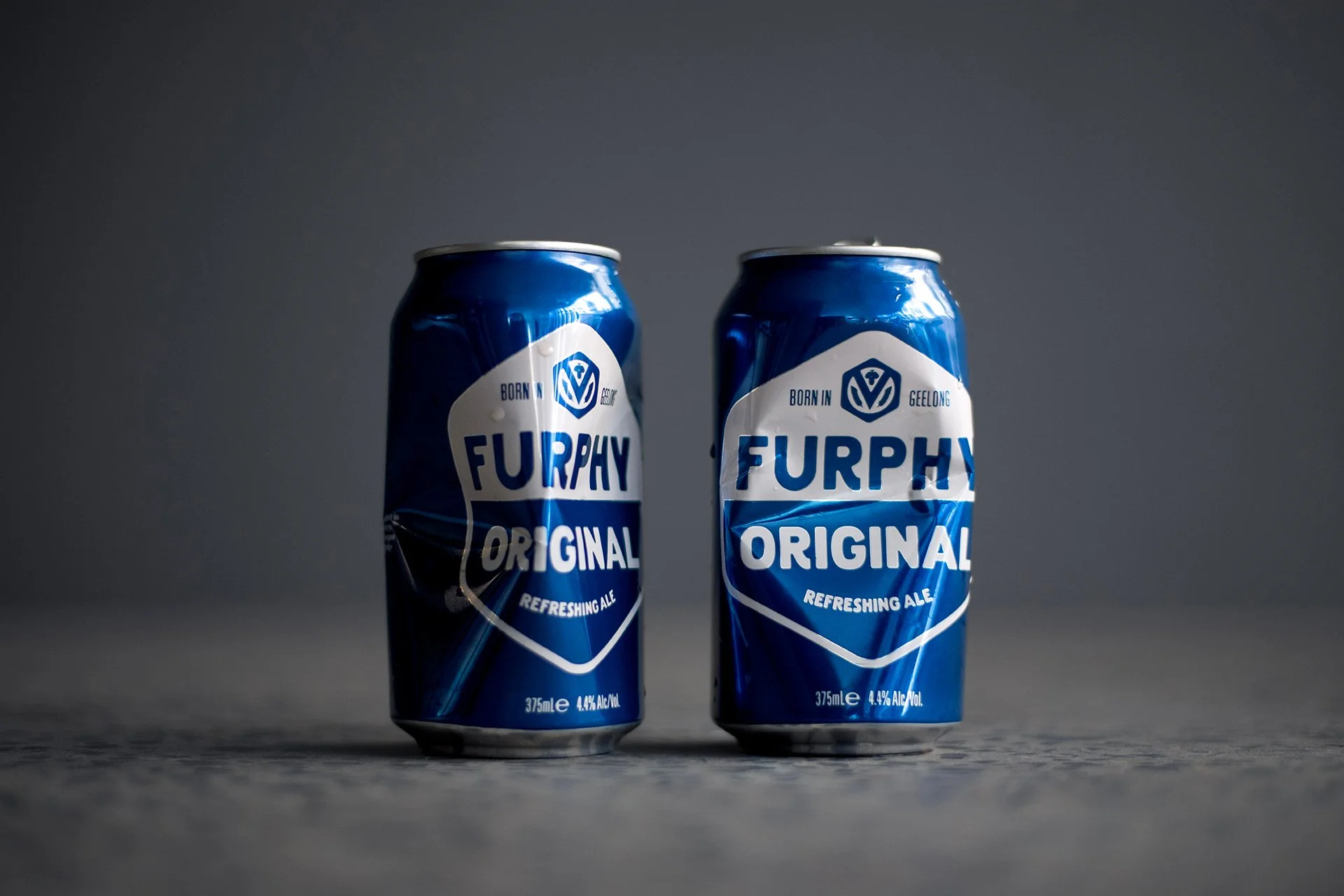
Furphy was well known for its Refreshing Ale across Australia, but with its expanding product range, the necessity to optimise the brand assets and packaging arose. We needed to ensure that each variant was easily distinguishable, whilst solidifying an equal relationship between their Ale and Lager. The dual objective was to establish a definitive masterbrand identity to enhance the overall brand experience.
The Solution
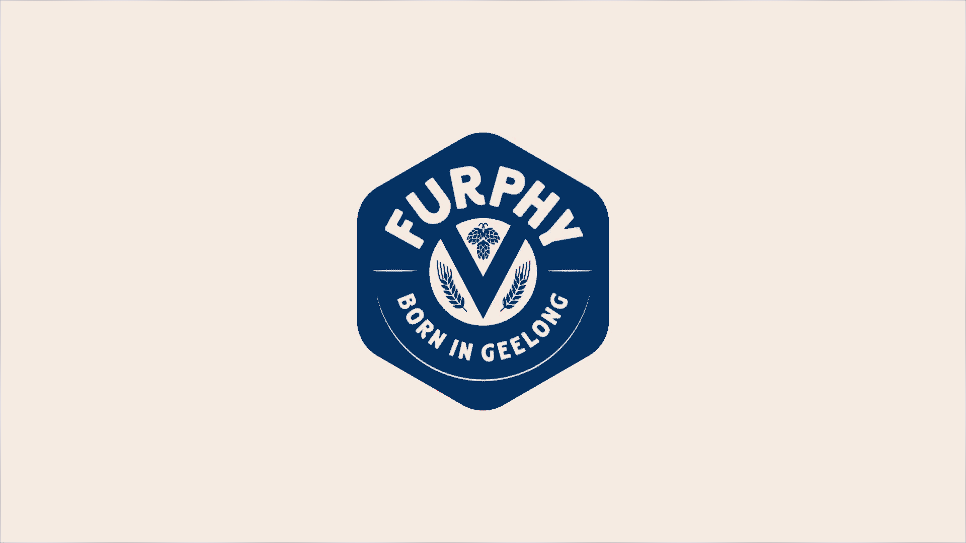
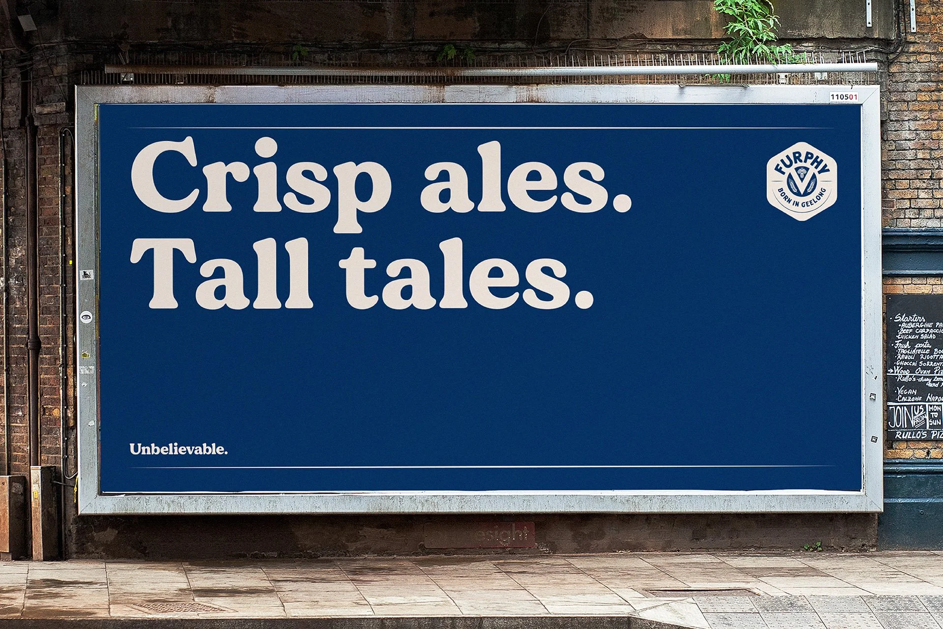
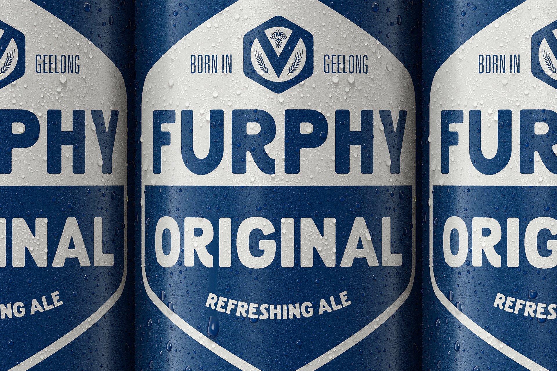
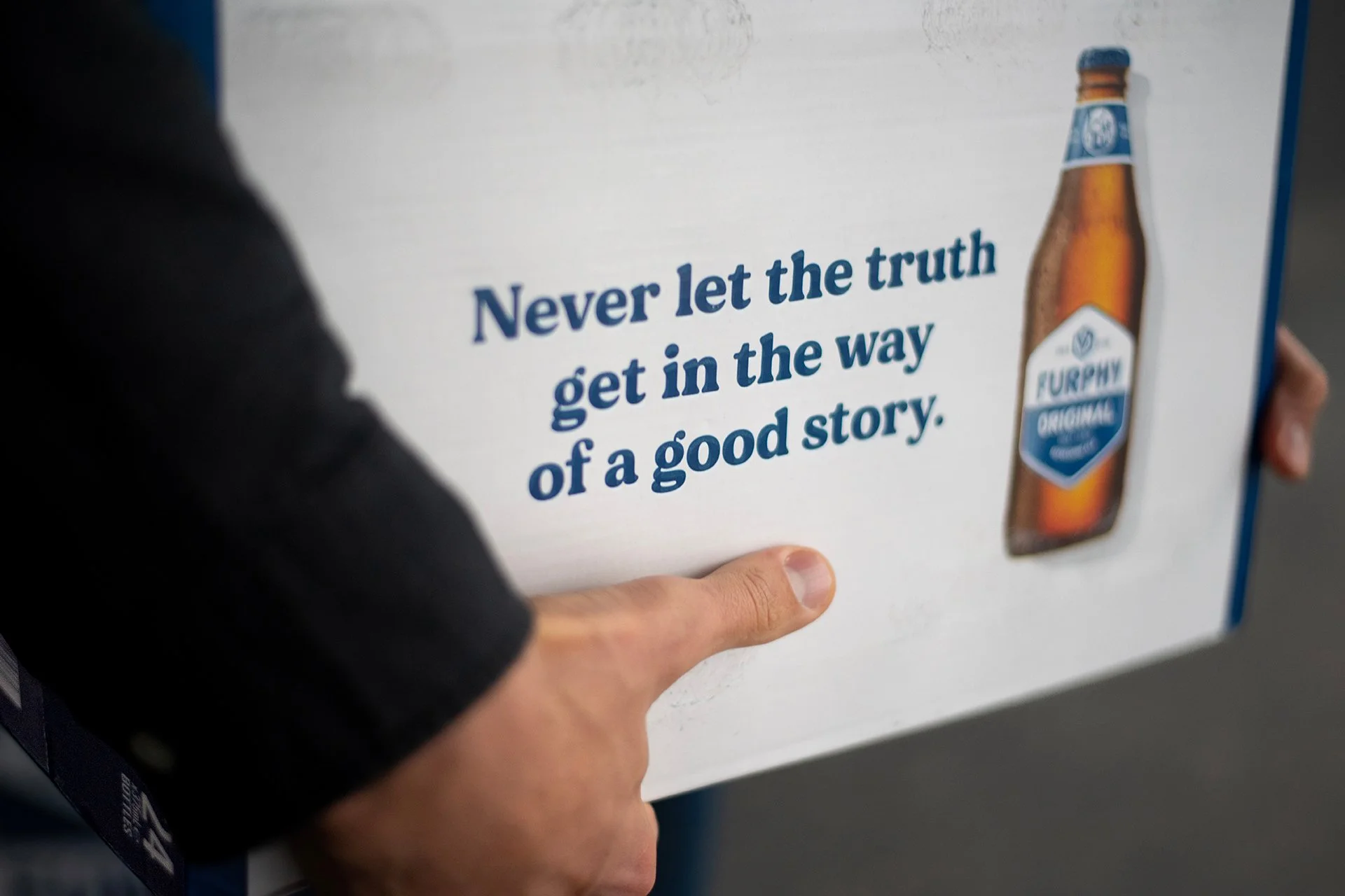
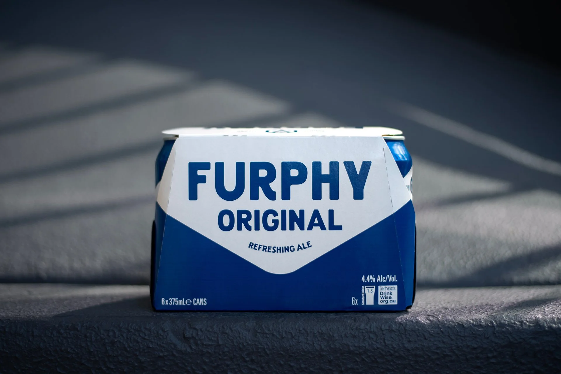
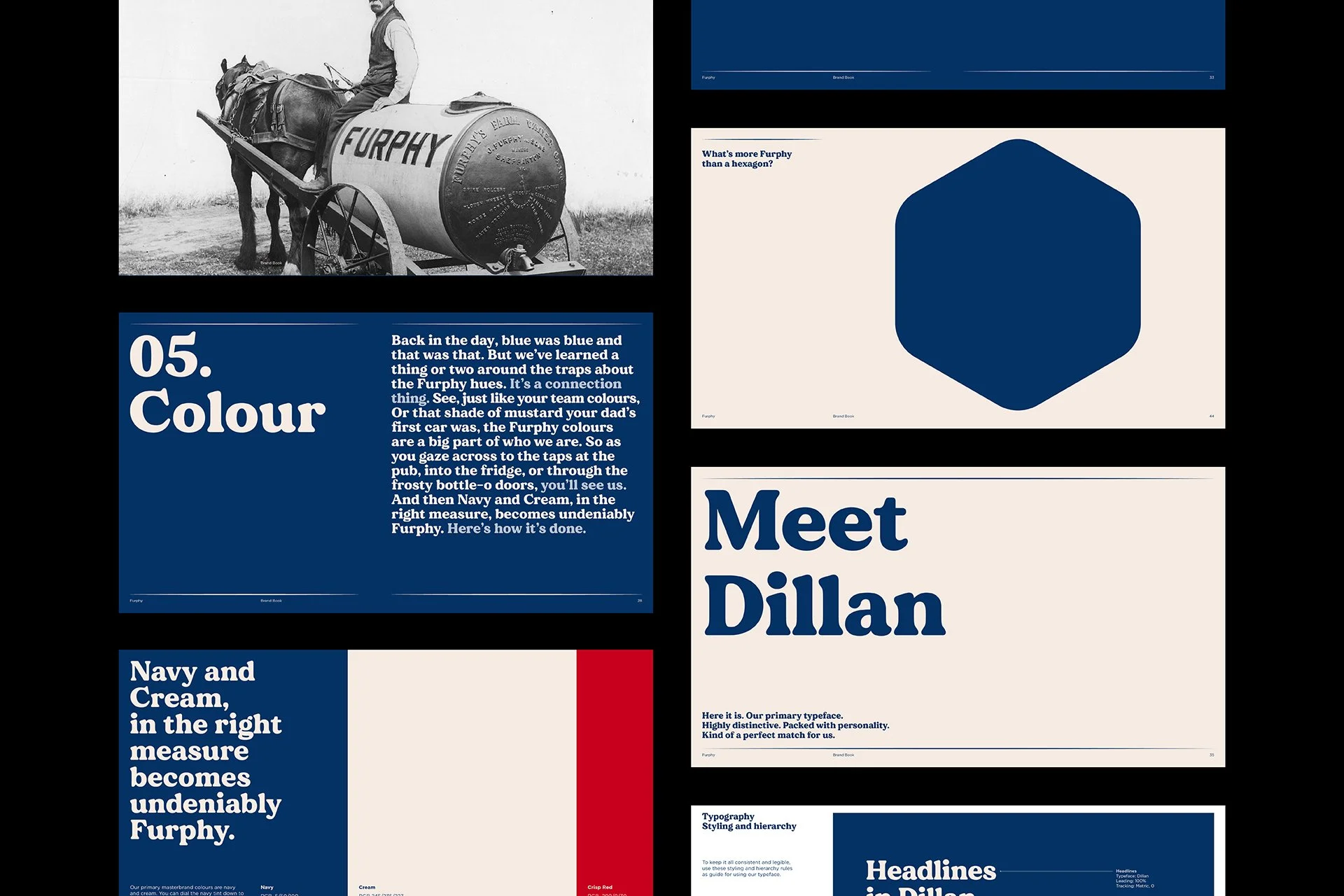
To support the expansion of the Furphy family, we recognised the need for a brand system, so started by defining what makes a Furphy. Was it the hexagon, the navy-cream palette, the typography, bottle, or all of the above? Elevating the distinctive elements of the original Furphy Ale, we fine-tuned these assets and delineated their roles on pack versus masterbrand. We introduced a versatile and complimentary visual language that could flex to support new variants, and crafted a refreshing tone of voice designed for telling unbelievable stories with an uncanny ability to draw people in.
Credits
Completed at Landor Australia
Client: Lion
Design: Abi Singmin, Chiara La Rosa, Patrick Carroll, Darren Mulkerrins, Nicola Ferry, Sam Wall
Copywriting: Carrie Dennes
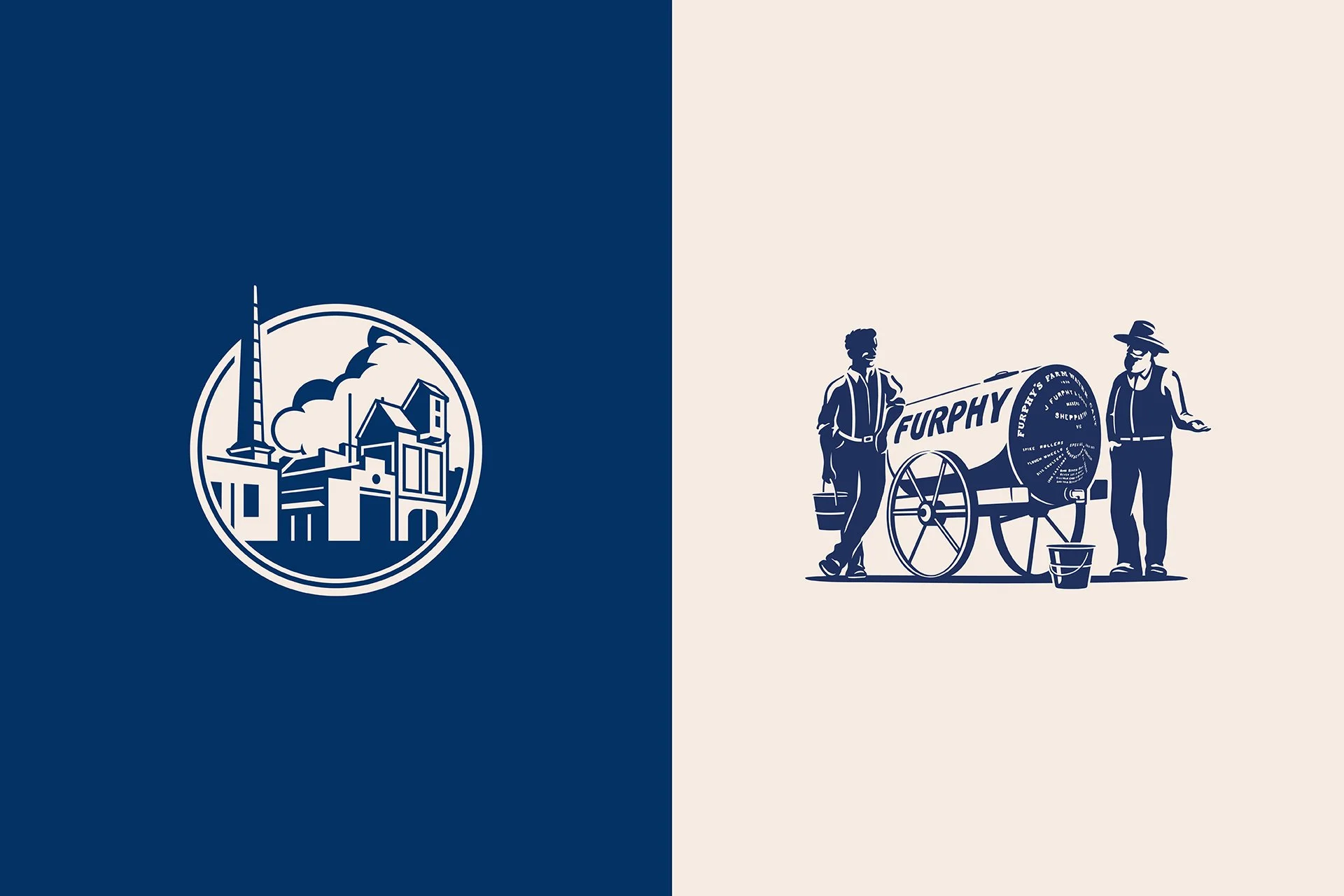
Illustration: Mat Hede
CGI: Visual State
Client Services: Eeke Braaksma